
Brochure website or B2B website: the two are not really opposites. "Brochure" describes the site's role, presenting a business and prompting contact; "B2B" describes its audience, companies buying from other companies. To choose, look mainly at how many people decide to hire you and how long they take to think it over.
If one person decides quickly, someone looking for a plumber or a practice to call, a few well-built pages are enough. If several decision-makers, a technical offer and markets in several languages are involved, you need a broader structure. Here are the criteria, the typical cases and the mistakes that prove expensive.
Brochure website or B2B website: what is the difference?
The vocabulary keeps the confusion going. An industrial company can perfectly well have a brochure website, since it sells nothing online. And an accounting firm that only works with businesses is doing B2B with a five-page site.
The useful difference lies elsewhere: in how much information a visitor has to find before acting, and in how many different visitors you need to convince for a single sale.
The brochure website: convincing one person, quickly
A brochure website speaks to someone with a precise need and little time. They want to know what you do, whether you cover their area, whether you can be trusted and how to reach you. They often decide within minutes, on their phone.
The format is therefore short by nature. Each page answers a question the future customer is asking, and each page gives them a way to contact you. What matters: concrete proof, correct contact details and no friction between interest and the call.
The B2B website: equipping a buying group
A B2B website, in the sense we use here, supports a longer sale. The person who discovers your offer is almost never the one who signs. They have to pass information on to colleagues who have different questions.
The site then becomes a reference file. It covers the sectors served, the applications, the technical proof, the references, and different entry points depending on the visitor's profile. It needs more pages and more content, so more time to produce.
Which criteria help you choose the right format?
Four questions are usually enough to decide. Answer them with what actually happens in your sales, not with the image you want to project.
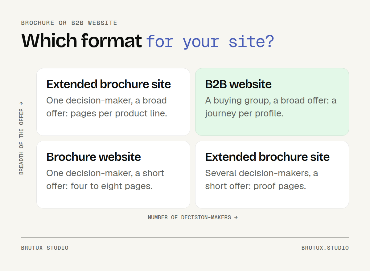 Two axes are enough to place your need: who decides, and what has to be explained.
The matrix is simple to read. Bottom left, one person decides and the offer is short: that is the brochure site. Top right, a group decides and the offer is broad: that is the B2B website. In the other two boxes, a brochure site extended with a few proof pages is often enough.
How many people make the decision?
This is the main criterion. If a single person chooses, a private customer or the manager of a small business, the site's job is mostly to reassure and make contact easy. If an engineer, a buyer and senior management are involved, each needs to find their answer without going through the others.
Try the exercise on your last ten sales. How many people did you meet or speak to on the phone before the contract was signed? Who asked the hardest questions? The answer already sketches the number of journeys your site has to plan for.
How broad is your offer?
An offer that fits into three or four services works well on a short site. An offer covering several product lines, sectors or processes calls for a site structure designed so that people can find their way.
Google makes the point in its starter guide: organising a site logically helps search engines and visitors understand how the pages relate to one another (Google Search Central). The same guide recommends addresses made of useful words rather than random identifiers. The broader the offer, the more this organisation counts.
A simple test: sum up each service in one sentence, as you would for a customer. If the list fits on one page, a brochure site will do. If it spills over, the site structure becomes a project in its own right.
What should happen after the visit?
A brochure website aims at one simple action: a call, a quote request, a booking. A B2B website offers several, depending on where the buyer is in their thinking: download a sheet, request a sample, book a demo, talk to an engineer.
If all your enquiries look alike, a single form is enough. If they differ by need, plan forms by intent that explain what happens after sending. This point, more than the design, is often what separates the two formats.
Think too about what your team receives. An enquiry that arrives with its page of origin and the type of need is handled faster than an anonymous message.
When is a brochure website enough?
In far more cases than people think. The urge to "go big" often comes from comparing yourself with larger competitors, rarely from a real customer need.
Local businesses
Tradespeople, shops, restaurants, professional practices, small service businesses: your customers search close to home and decide fast. For them, a well-built brochure website beats a deep site structure they will never explore.
In these trades, the site works alongside your Google Business Profile. Under Google's rules, only businesses that make in-person contact with their customers are eligible for one, and a business that travels to its customers should not declare an area beyond roughly two hours' drive (Google Business Profile Help). The site must repeat exactly the same information.
We go into this local work in our article on local SEO in the Chablais. For a project in or around Thonon, our web agency in Thonon-les-Bains page describes how we work on the ground.
A firm that only serves businesses also falls into this category. An accountant, a business lawyer or an independent consultant sells to professionals, but the decision often rests with one or two people. A carefully built brochure site, with clear specialities and references, meets their need.
What a good brochure website contains
Usually four to eight pages: home, services, projects, about and contact. A business covering several towns can add a page per area, provided each one brings information specific to that place.
The copy starts from your customers' questions, not from a description of your company. The call button stays visible on mobile, the form is short, and the photos show real jobs or real premises. With us, this format goes live in 10 to 15 days, as explained on our brochure website design page.
Three signs that a brochure site is still the right choice:
- Your customers call you after seeing a few photos and checking your details.
- A single person makes the decision on the customer's side, or two at most.
- Your offer can be explained in a handful of services, with no technical documentation.
When should you move to a B2B website?
When the site has to do part of the sales work for you, with people you may never meet before the tender.
The move does not depend on company size. A twenty-person SME selling to manufacturers often needs a B2B website more than a large local retailer does.
A buying committee to convince
Gartner describes B2B buying as six "jobs" the buyer must complete, from identifying the problem through to building consensus. The firm adds that validation and consensus creation run throughout the entire process (Gartner).
In practice, your site will be read several times, by several people, at different moments. The engineer looks for tolerances and standards, the buyer for terms and lead times, management for a reason to say yes. A single message speaks to none of them.
The answer lies in the structure: entry points by sector, application or problem, and for each profile, pages that help them champion your bid internally.
Technical proof to publish
Professional buyers want facts. Many manufacturers publish their technical sheets only as PDFs: they read poorly on mobile and Google understands them less well than a web page. One HTML page per product or product line, with the PDF as a download, serves both the engineer and your search visibility.
Price is the other proof people expect. According to the Nielsen Norman Group, visitors rank pricing information as their first need on any website, B2B included, and these sites often hide or obscure it (Nielsen Norman Group). Even without publishing a rate, you can at least explain how the price is built.
The LYCRA Company's B2B website, designed by Victor Michel, the studio's founder, illustrates this approach: a technical offer organised by profile, for brands and manufacturers around the world.
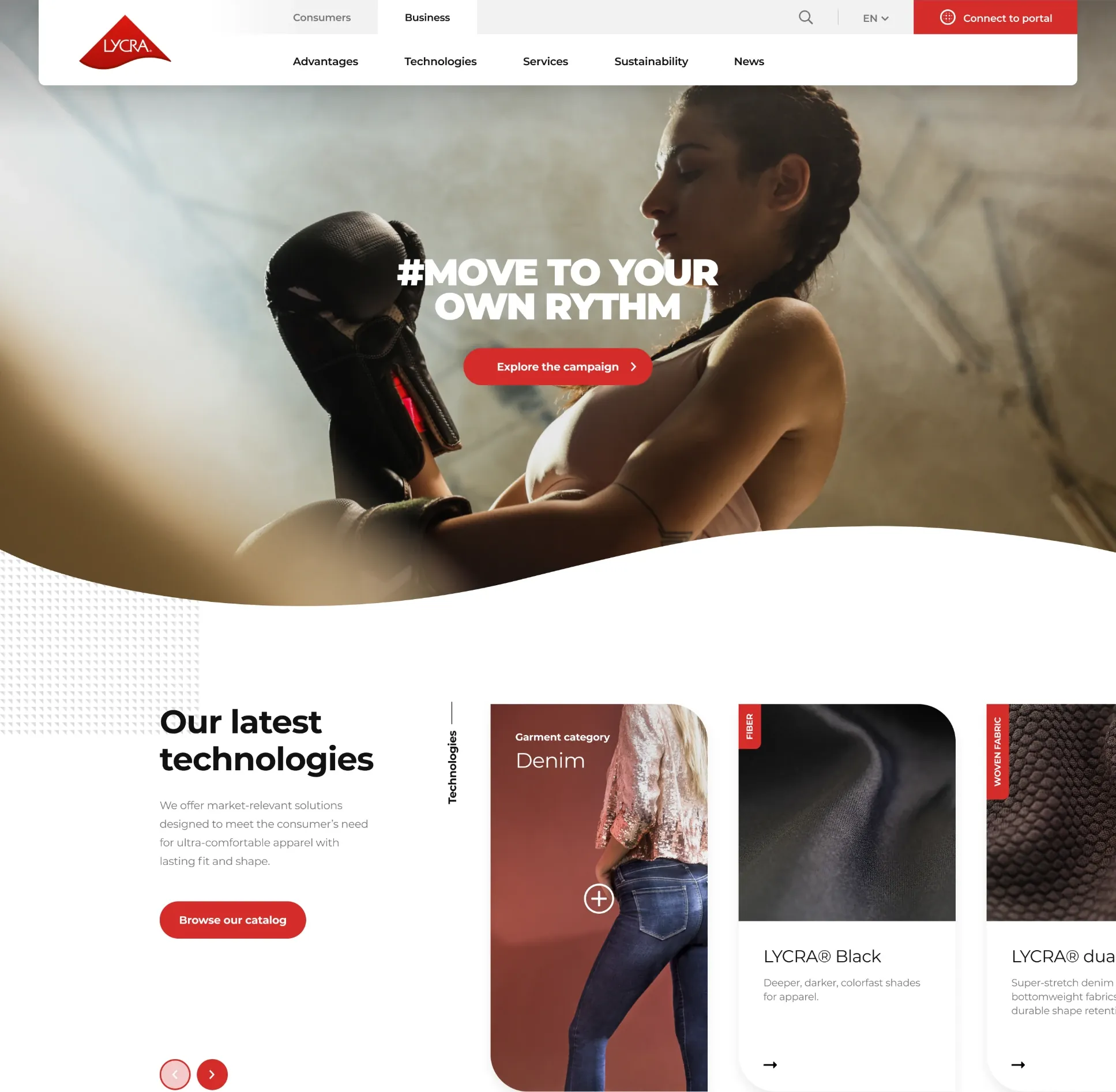 The LYCRA Company's B2B website: information organised by visitor profile.
Several languages, several markets
A company based between Thonon and Geneva may sell in France and in Switzerland, sometimes as far as German-speaking Switzerland. Each language version needs its own addresses, its own keywords and tags that link the versions together.
Google explains that the hreflang tag tells it that pages are localised variants of the same content, and that it does not use it to detect a page's language (Google Search Central). In other words, the translation has to be real: a half-translated page fools no one.
Multilingual sites also cost more to maintain: every new page has to exist in every language. Two well-kept languages are better than four versions drifting apart.
This multilingual need is common among organisations working from Geneva, as we explain on our web agency in Geneva page. For the details of what this format includes, see our B2B website design page: with us, it takes 3 to 6 weeks, depending on the volume of content and the number of languages.
Which mistakes should you avoid when choosing?
Most bad choices have nothing to do with technology. They come from a format decided too early, for the wrong reasons.
Choosing by org chart or by budget alone
First mistake: building the menu around your internal organisation. Your departments, subsidiaries and product line names make sense to you. The visitor is looking for an application, a constraint or a case close to their own.
Second mistake: picking the large format to look bigger. A thirty-page site with twenty empty or copied pages looks less serious than six precise pages. Google says as much in its guidance on helpful content: its systems aim to reward reliable information created for people (Google Search Central).
Third mistake, the mirror image: squeezing a complex offer into a brochure site to save time. A buyer who cannot find your technical sheet will not call to ask for it. They move on to the next supplier.
Forgetting what the site will have to contain
A B2B website without content is an empty shell. Before choosing this format, check that you have enough to fill it: case studies, sheets, references, real photos, and above all a person in charge of approving the copy. Internal approval is almost always what makes the schedule slip, as we describe in our article on the steps of a website project in Thonon.
The basic obligations apply to both formats. For a brochure site offering a simple contact form, the CNIL, the French data protection authority, requires at minimum information notices below the form, an electronic way to exercise one's rights and a legal notice identifying the site's publisher (CNIL).
A B2B website connected to a CRM handles more data: plan for it from the design stage. Each form should state what the information requested is used for.
The last frequent oversight: what comes next. A brochure site lives with a few updates a year. A B2B website grows with products, sectors and job offers. It therefore needs to rest on reusable components, otherwise every addition turns into a small project.
How do you decide without getting it wrong?
The criteria point you in a direction. To be sure, nothing beats something concrete, seen and discussed by the people who will decide.
See a prototype before you decide
Our current method is to iterate with quick prototypes, built with AI, rather than with a series of grey mock-ups. Before any development, you click through a first version of your site, with a provisional structure and copy.
For a brochure website, a personalised preview even reaches you within 48 hours, based on three questions about your business. You judge the format on something real, not on a description.
This often settles the format question better than a meeting does. If your teams find everything in four pages, a brochure site is enough. If everyone asks for their own section, their own proof and their own language, the B2B website wins, and you already know why.
AI speeds up the production of the prototype; it replaces neither the thinking about your customers nor the writing of the final copy in your own trade vocabulary. The prototype helps you decide quickly, then the final site is custom-built in code, and it belongs to you.
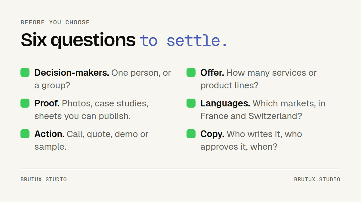 Six questions to ask yourself before approving your site's format.
The checklist before you sign
Before approving a format with any provider, answer these questions in writing. They apply to any project, with us or elsewhere.
- Who decides on your customers' side? One person, or a group with different expectations.
- How many services or product lines must be presented? Count them, without grouping them artificially.
- What proof do you already have? Photos, case studies, sheets, references you can publish.
- In which languages do you sell? And in which markets, in France as well as Switzerland.
- What action do you expect after the visit? A call, a quote, a demo, a sample.
- Who writes and approves the copy? With a name and dates.
If your answers fit in a few lines, start with a solid brochure site that you can extend later. If every question opens an internal debate, plan a B2B website, and start with the structure.
The right format is the one that matches how your customers decide, not the size of your company. For a local business, discover our brochure website design service; for a less clear-cut case, let's talk directly.
Sources
- Gartner: the six jobs of the B2B buyer
- Nielsen Norman Group: articles on B2B websites
- Google Search Central: SEO starter guide
- Google Search Central: localised versions of your page
- Google Search Central: creating helpful, reliable content
- Google Business Profile Help: guidelines for representing your business
- CNIL: GDPR in practice, communicating online (in French)