Redesigning Bouygues Telecom’s mobile customer area.
Redesigning the customer-area app of an operator with 15 million mobile customers, led by Victor Michel: UX audit, new navigation and a design system built from scratch.
Telecoms · Consumer mobile app
15 M
mobile customers
0→1
design system built from scratch
Lead UX · Design system · User testing
The context.
Bouygues Telecom has 15 million mobile customers in France. Its customer-area app is where they check their usage and catch up on the operator’s news, often several times a month. For many of them, it is the main point of contact with the brand, well ahead of the shop or customer service.
By 2019 the app was showing its age: an outdated information architecture, years of accumulated UX debt and slipping satisfaction. A full redesign had become necessary, under one firm constraint: modernise without unsettling users attached to their habits, and roll out gradually with no interruption of service.
Victor Michel, now the founder of Brutux Studio, led the design of this redesign. He coordinated the product, design, development and marketing teams and mentored junior designers throughout the project. With no formal authority over those teams, his job was to keep them moving in the same direction by making the case for every choice.
The challenge: Redesigning an app used by millions of customers leaves little room for approximation: every landmark you move affects a great many people. Years of UX debt had to be fixed, navigation rethought and a lasting design system put in place, while shipping at sprint pace and keeping the trust of users who had not asked for change. And several teams had to move together without the interface splintering.
The approach.
01
Auditing the existing app
The work began with a full UX audit of the app. Every problem found was ranked by impact and frequency. This grid became the shared basis for prioritising the redesign and for explaining to the teams why one journey came before another.
02
Reading the usage data
The qualitative audit was cross-checked against the data: active users, critical journeys, satisfaction by profile. This showed where customers dropped off and which journeys deserved the most attention, and it served as a point of comparison throughout the redesign.
03
Rebuilding the information architecture
Navigation was redesigned from the users’ side: card sorting with customers, then tree testing and several validation rounds. The new structure therefore rests on what people actually look for, not on the company’s org chart or internal hunches.
04
Building a design system from scratch
Victor built a complete design system: design tokens, components and usage guidelines. He maintained it for the whole project, so designers and developers shared one foundation and the interface stayed consistent from screen to screen, whichever team was shipping.
05
Working hand in hand with the back end
Regular sessions with the back-end teams covered API design, error states and edge cases together. A consumer app is also judged by what it shows when data is missing or a service is slow to respond.
06
Growing the team
Victor mentored junior designers through mockup reviews, structured feedback and growing autonomy. He also set up weekly design reviews and documentation standards that stayed in place after he left, and stood up for craft quality in sprint trade-offs.
The screens.
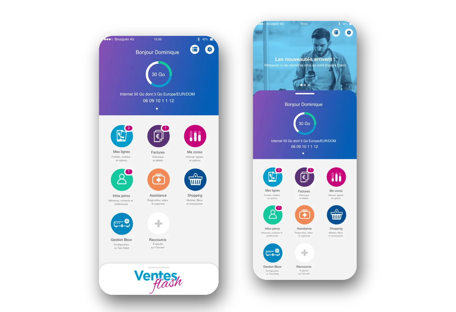
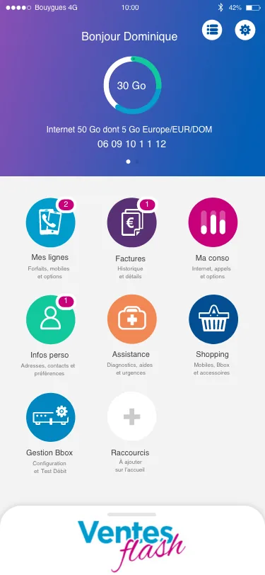
Bouygues Telecom customer area: home screen with usage tracking
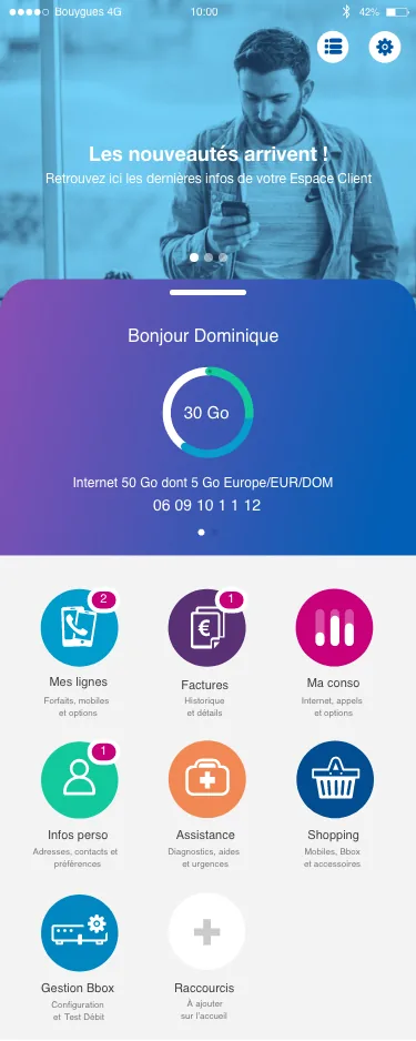
Bouygues Telecom customer area: screen with the news banner
What this project taught
Leading without formal authority means you have to persuade. Victor could not impose his choices on developers or his priorities on marketing: he had to argue for them, with tests and data. That stance became a method. A design system, a UX redesign or a new navigation only lasts if the teams who maintain it understand why it is the way it is.
What it means for your project
A large redesign raises the same questions for a consumer app as for a B2B SaaS product: where to start, how to avoid a break for existing users, how to stay consistent when several teams ship in parallel. Brutux Studio draws on this experience for its SaaS redesigns and UX audits: a prioritised diagnosis, an information architecture tested with users, and a documented design system the product team can then run on its own.