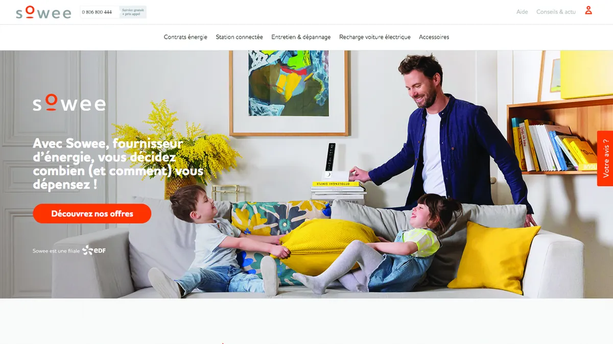
Victor Michel led the redesign of the e-commerce site of Sowee, EDF’s connected-home brand: data analysis, user testing and A/B testing.
Energy · B2C e-commerce
EDF
subsidiary dedicated to the connected home
A/B
design decisions validated by testing
Lead UX · Conversion strategy · A/B testing
The context.
Sowee, EDF’s subsidiary dedicated to the connected home, sold a connected heating remote online. The e-commerce site worked and the product delivered, but too few visitors went through to an order. The traffic was there; the sales were not.
Faced with this, the reflex was to spend more on advertising. Victor Michel, now the founder of Brutux Studio, argued for a different route: remove the friction that drove visitors away, rather than sending ever more of them into a journey that could not keep them.
He led the strategic analysis, challenged the initial assumptions with user research rather than gut feeling, and drove prioritisation with the Product Owner and the front-end teams, all the way to presenting the conclusions to senior management. His role: replace debates of opinion with facts, and give every design decision a verifiable reason.
The challenge: Buying a connected heating device online takes trust: understanding what it brings, feeling reassured about how it works, picturing the possible savings. The challenge was to show, with data, that the problem lay in the journey rather than in traffic volume, then to improve conversion through tested changes rather than convictions.
The approach.
01
Reading the data
Victor started by analysing the conversion funnels in Mixpanel, heat maps and Hotjar session recordings. The data showed where on the site and in the checkout funnel visitors hesitated, went back or gave up.
02
Listening to the hesitations
Qualitative user tests completed the numbers. They mapped the objections, the moments of doubt and the exact points where participants left the funnel. Data tells you where visitors are lost; testing tells you why.
03
Framing hypotheses
Several ideas were framed and then put to the test: stronger product reassurance, fewer steps, social proof, a savings calculator built right into the journey. Each one answered an objection raised during testing, and none was adopted on gut feeling alone.
04
Redesigning the key pages
The home page, the product page and the checkout funnel were reworked around a new hierarchy: customer benefits first, technical features second. A simple change on the surface, yet one that alters how the whole page reads.
05
Validating through A/B testing
Several versions of the product page were compared through A/B testing with Optimizely, over a period long enough to yield reliable results. Final decisions rested on those measurements, not on anyone’s personal preference.
06
Presenting the conclusions to leadership
The findings and long-term recommendations were presented to leadership. Beyond the redesign itself, the aim was to establish a way of deciding: test before investing, and judge a page by what it achieves rather than by the opinion of whoever is most convinced.
What this project taught
Conversion is not primarily about buttons or colours: it is about trust, and trust can be designed. On Sowee, the most effective interface was also the least noticeable. Nobody remarked on it, because it no longer put obstacles between visitors and their decision. Understanding why people leave, then removing what holds them back, remains the core of a product designer’s job.
What it means for your project
A website or SaaS sign-up page that converts poorly raises the same question: more traffic, or less friction? Brutux Studio answers it with the method proven here: data analysis, user testing, explicit hypotheses, then a redesign of the pages that matter. This approach feeds UX audits as much as website redesigns and SEO work, because a page that ranks well still has to convince the people who land on it.