LinsenMax, a smoother journey for buying contact lenses.
Victor Michel reworked the purchase journey of LinsenMax, a Swiss online contact lens store: from the home page to checkout, mobile included.
E-commerce · Optics
E-commerce
contact lenses and care products
Mobile
purchase journey reworked for phones
Lead UX · E-commerce journeys · Mobile design
The context.
LinsenMax sells contact lenses, care solutions and sunglasses online in Switzerland. For this kind of store, most customers come back regularly: when a box runs out, they need to reorder, with the right parameters, without wasting time.
In 2020 and 2021, working from Lausanne, Victor Michel, now the founder of Brutux Studio, reworked the site’s purchase funnel, from the home page to checkout. Mobile had to be designed as a journey in its own right, not as a shrunken version of the site.
On a retail site, every step removed or clarified is felt directly in sales. The work therefore focused on how people find the right product, understand it and order it, rather than on a simple visual refresh.
The challenge: Buying lenses online is nothing like an impulse purchase. You have to find your brand, choose the right wearing schedule and correction type, compare pack sizes, then order with confidence. The challenge was to make this journey quick for loyal customers who know what they want, without losing first-time visitors who need guidance.
The approach.
01
Understanding the two kinds of buyer
The returning customer and the newcomer do not expect the same thing. The first wants to reorder in a few taps; the second needs guidance to choose. The journey was designed to serve both without one getting in the other’s way.
02
Clarifying the home page and navigation
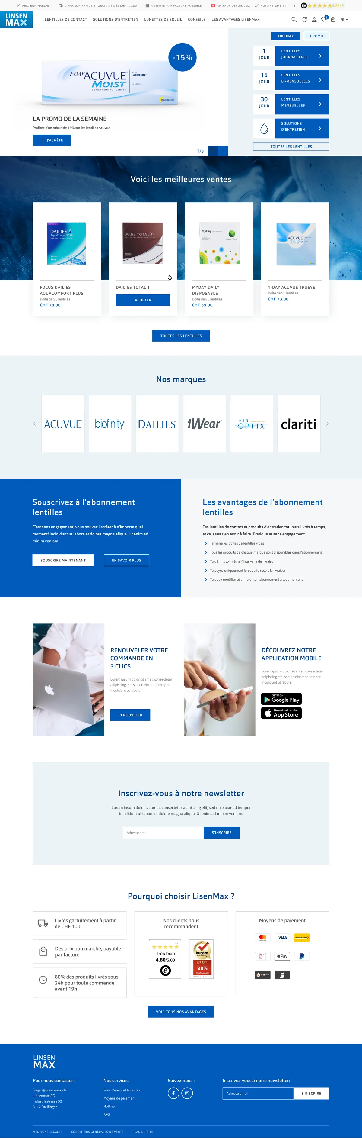
The home page quickly points to the main product families and brands, with direct access to reordering. The reassurances that matter for an online store, delivery, payment methods, customer service, stay visible without cluttering the screen.
03
Helping people find the right product
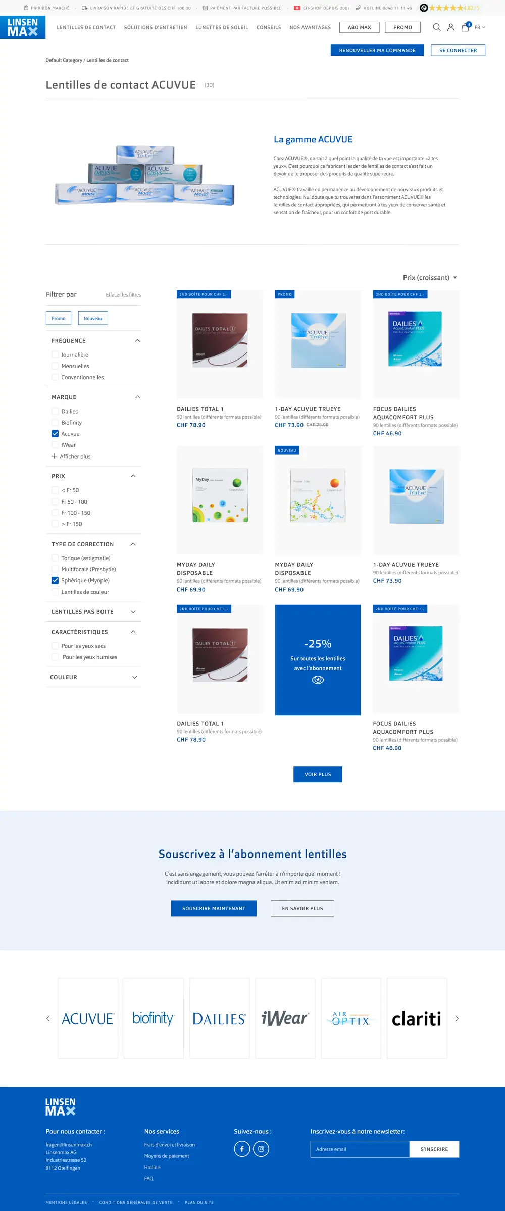
Range pages offer meaningful filters: wearing schedule, brand, price, correction type. Each product clearly shows its pack size and price, so customers can compare without opening ten tabs.
04
Lightening the checkout funnel
From cart to confirmation, every step was questioned: what could be removed was removed, and what remained was clarified. The aim was for customers to always know where they stand and what is left to do.
05
Designing for mobile first
On phones, filters, product pages and payment were reworked for thumbs and small screens. The mobile journey was treated as a primary journey, not as a last-minute adaptation.
06
Taking care of the developer handoff
Annotated mockups, component states, edge cases: the documentation handed to developers made it possible to ship the journey as designed, without reinterpretation at build time. On a retail site, a detail lost between mockup and launch always ends up costing orders.
The screens.
LinsenMax: range page with filters by wearing schedule, brand, price and correction type
What this project taught
In e-commerce, smoothness comes down to details: a well-named filter, one step fewer, a price that is readable at the right moment. LinsenMax was a reminder that a retail site often serves two audiences at once, the loyal customer and the newcomer, and that a good journey forces neither to walk the other’s path.
What it means for your project
Does your site sell online but lose visitors along the way? Brutux Studio audits your purchase journey, finds the steps that slow people down, then reworks the pages that matter: home, range, product page, cart, payment, on mobile as well as desktop.